Showing posts with label STARS Challenge. Show all posts

Wednesday, September 26, 2018

DOStamper Stars Challenge - Sketch Pad DSC #299


Good evening!  The last few weeks we have been treated to some cooler weather, with a few hot days mixed in.  The leaves are turning and starting to fall.  The smell of leaves, fire and harvest are in the air.  So, after coming in from a golden evening playing outside with my daughter, I was in the mood to make something fall.  I used the sketch below, but turned it on its side and I'm really happy with how it turned out.  I have the perfect recipient in mind, too!

The colors I used are Pumpkin Pie, Cajun Craze, Early Espresso, Very Vanilla, and Old Olive.  I used the new Buffalo Check background stamp and the Falling for Leaves stamp set and accented it with a simple strip of Braided Linen Trim.   I watercolored with my ink refills and an Aquapainter on our watercolor paper.  That was so relaxing!!!  You have to try it if you haven't.  To give it a little dimension I heat embossed the leaf image.  That also helped keep the ink in place -though there are a few places where it escaped.  And that's okay.  I was going for a rustic look anyway!  Happy stamping!!!


Wednesday, September 5, 2018

DOStampersStars Thursday Challenge ShowCASE DCS#296


Good evening, stampers!  If you follow my blog, you've noticed that I've been MIA.  I had a sweet little one join our family  just over a year ago and she has been keeping me busy.  I've been struggling because I want to make the time to stamp, but I also feel like I don't have time to regularly make the extremely detailed cards that are my favorite to work on.  And so, instead of doing something, I've done nothing.  And all it's done is make me miss this habit...I mean...hobby even more.  And then I got to thinking...I'm just like everyone else.  While we may have different demands on our schedule, we all have demands on our schedules.  It might be caring for kids, or elderly parents, it might be serving your church or community, it might be a job or jobs, other hobbies, caring for your home or cars, etc.

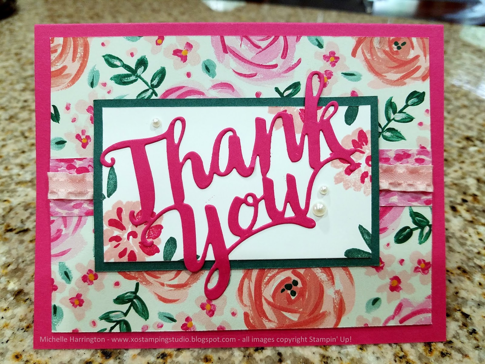
So then I thought "hey, maybe my stampy friends would enjoy some inspiration that is easy to replicate so that they, too, can squeeze in a bit of crafty time.  So, I gave myself an hour today, sat down and made this card.  It took less than an hour (and that includes pulling out all the supplies, dragging them upstairs to work and then going back down several times for things I needed).  You could save yourself even more time and make several while you have everything out.  I used our Thursday challenge image (below) as inspiration.   I kept the landscape orientation, and I also kept the central focal point as well as the horizontal details underneath the focal point.  I kept floral theme and also used a large sentiment.  The steps are simple and found further down in this post.I hope this post finds you well and hope that you are able to make a little time for yourself in the midst of all the busy-ness we seem to have in our modern lives.  


(1) Cut out your base layer (I used Melon Mambo) and score/fold it to create the card.
(2) Pick a pretty piece of Designer Series Paper (I used Garden Impressions) and cut it down to 4"x5.25".
(3) Cut a strip of coordinating Designer Series Paper (DSP) down to 5.25" by 1" (again, I used Garden Impressions).  Tip: this is great way to use scraps.  Adhere it across the middle of the 4"x5.25" piece.  I like to use Snail adhesive for this.
(4) Choose some ribbon (I chose the 3/8" Mini Ruffled Ribbon in Powder Pink) and adhere it down the middle of the DSP strip. I like to do this step now so that the ends of the ribbon can be tucked under this panel before it is stuck to the card base. 
(5) Cut a 3.5"x2.25" rectangle of colored cardstock that coordinates with your DSP (I chose Shaded Spruce).
(6) Cut a 3.25"x2" rectangle of Whisper White Cardstock (can use some other light neutral, like Very Vanilla, if it coordinates better with the paper you chose).
(7) Stamp the white rectangle with images and colors that work with your DPS (I chose the Abstract Impressions stamp set, which was designed to go with the Garden Impressions paper).
(8) Stamp or adhere a die cut sentiment to the center of the white rectangle.  (I cut Thank You from a scrap of Melon Mambo).
(9) Adhere the white layer to the colored layer, then layer that over the center of the DSP assembly.  Then adhere all of that to the card base. 
(10) Decorate with small accents.  I chose our adhesive pearls.


Wednesday, August 24, 2016

DOstamper STARS Sketch Challenge DSC#195


Lately, I’ve been trying to finish up some of the projects I’ve left lying around half-finished for a while.  One of those projects was finishing up an old Paper Pumpkin kit (Blissful Bouquet) that I had started and never finished.  Once I got those done, I decided to try to use the stamp set from that kit to create a card using this week’s sketch challenge.  


Even though my part of the world has seemingly moved into “autumn mode” I decided to resist the lure of deep, rich fall colors and, instead, chose the cheery colors of Delightful Daffodil and Pool Party.  I think the yellow/white/blue combination is classically cheerful & always had such a clean feeling.  I love it.  This card was unusual for me in that I didn’t add a single embellishment….but I quite like the simplicity of it for a change. The long skinny sentiments from the Floral Phases stamp set were perfect for this sketch.

After finishing the card for the challenge, I decided to make a similar card with some variances, which you can see below.  Which do you like better? 


Be sure to check out how my friends used this sketch to create their cards this week by clicking on the links below:

Wednesday, August 17, 2016

Making Flowers from Foxes - DOstamper STARS Challenge - DSC #194 starring the Fox Builder Punch


This week's challenge was to use a NEW stamp - so something that was new to this year's annual catalog or something from the yet-to-be-released-to-the-public Holiday Catalog.  So far, I only have one new punch, the Fox Builder punch,...so guess who got out to play?  Yup, this little critter.  I am going to have soooo much fun with this little guy!  

So, about this project...one of the reasons I love to buy (and keep) the punches is because you never know what sort of punch art you can create with them.  There are tons of ideas on Pinterest and online galleries, so I have never regretted buying and saving these tools.  Today I wanted to look at the punch a little differently...I have seens TONS of cute cards already using the fox as a fox, cat, skunk, squirrel and other critters.  But I wanted to challenge myself to think outside the box.  Low and behold, I noticed that part of the punch layered to create a pretty little flower. 

What are some of your favorite "outside-the-box" uses for Stampin' Up! punches?

Here's what the Fox Builder punch looks like!

And here's how I punched out the flower parts - it took 4 pieces to make this flower.


To make this, you’ll need:


To see how my friends used their new punches, check our their blogs by clicking on the links below...

Wednesday, August 3, 2016

8/4/16 DOstamper STARS Thursday Challenge


I knew as soon as I saw these colors that I would do something with snowflakes - the colors just seem so crisp and clean with white & they scream serenity, don't they?  And I find snow to be serene.  Since I knew right away what the theme would be, I figured it didn't count as much of a challenge, right? So, I went ahead and tried a technique I had never tried before.  My upline calls it "Triple Time" stamping.  I've always thought it was pretty but just have never taken the time to figure it out.  I'm really glad I did because I think it was a neat effect here. Want to see more cards with the same color scheme?  Check out my friends' blogs here:


And if you decide to try this scheme yourself, post a link to your work in the comments - I'd love to come check it out!


Wednesday, July 27, 2016

DOstamper STARS Challenge DSC #191


Phew, wee!  This was a challenge for me!  I really wanted to honor the original sketch with an oval-type shape in the upper corner, but try as I might, I couldn't get it right.  So, instead, I swapped the oval for a heart.  Also, the Peekaboo Peach & some of the patterns of paper in the Playful Pallette suite have been out of my comfort zone.  But you know, I'm glad I played until I got a little more comfortable, because I think this one turned out pretty good.  It still honors the sketch to a degree: a shape in the upper left, flowers & a horizontal element more towards the middle.  So, get out something that has you stumped and play - that's my challenge to you this week!  

Supplies: Sweet Sugarplum, Very Vanilla, Blushing Bride and Peekaboo Peach cardstock; Sweet Sugarplum ink; Playful Pallette Designer Series Paper, hearts thinlits, adhesive pearls, dimensionals & snail adhesives; Number of Years stamps, Large Numbers Framelits, Botanical Builder Framelits.

Now - go check out how my friends interpreted the same sketch:


Wednesday, July 20, 2016

DOstamper STARS Thursday Challenge #190


Hello, friends!  It's been a while since I posted - I was sick, and then recovering, and then busy helping friends with a few things, and then the usual summer busy-ness...but now I'm back in action.  Today's challenge is to use any of the Hostess Sets found in the new catalog.  Have you seen them?  If not, ask me to send you a catalog...it's free and comes with no strings attached.

The only way you can acquire hostess sets it to buy them with Hostess Rewards.  You earn Hostess Rewards by either placing an order for yourself over $150 OR having a workshop in your home or throwing a catalog party where sales total $150 or more.  The more you and/or your friends spend, the more you earn!  

I chose to use the "Pun Intended" set because I just fell in love with that little bee.  Can't you see why?  The rest of the card is simple...lots of layers, just how I like it.  Scroll down to see more angles of the same card, the challenge graphic and to follow the blog hop where you can see what my colleagues put together using their Hostess Sets.  HINT: we didn't all use the same set, so you'll want to go get inspired.  And once you do, give me a shout out and I'll help you throw a party for your friends so that you can earn these items for FREE!


Wednesday, June 22, 2016

DOstamper STARS Challenge: Product Spotlight DSC #186


This weeks challenge was to use the 2016-2018 In Colors.  Rather than trying to use them all at once, I zoned in on the Sweet Sugarplum, which is prominently featured in the new Playful Palette Designer Series paper.  I'm pleased with the results.  You'll have to keep your eyes peeled in the coming weeks to see other In Colors in my work.


Be sure to check out more "Product Spotlight" inspiration from the DOstamperSTARS Team (click on their names below):   

Wednesday, June 15, 2016

DOstamper STARS Challenge: Home Sweet Home DSC #185


Welcome to this week's challenge!  The third week of our challenge rotation is always called "Home Sweet Home" because we are asked to use a specific piece of home decor as our inspiration point.  We can use any or all aspects of the image provided...color scheme, theme, shapes, textures, images, whatever speaks to us.  This week's home decor item is in the image below and I zoned in on some of the colors and the butterflies & botanicals. 

One style of art work I have always admired but have never felt successful at doing is the layered, vintage look.  But, challenges are all about breaking out of your comfort zone, right? So I decided to give it a shot, and I'm pretty please. The images from the Butterfly Basics set made this card so, so easy!  If you are reluctant like me, give it a try - it's so much more fun and easy than you would ever think possible.
http://www.stampinup.com/ECWeb/CategoryPage.aspx?categoryid=12400&dbwsdemoid=2055485


I started with a rectangular Very Vanilla cardstock panel.  I used Early Espresso ink on a sponge to age the edges.  Next, I used Crumb Cake ink and a retired French script background stamp to create the background.  After that, I used more Crumb Cake ink and another sponge to apply some more aging to the whole panel in small circular motions.  After that I just started layering on the various images from the Butterfly Basics stamp set working from lightest to darkest.  The colors of ink I used were Pear Pizzazz, Old Olive, Crushed Curry, Crumb Cake, Soft Suede and Early Espresso.  Next came the sentiment stamped in Early Espresso (you can use any sentiment, mine is from the bonus set I received a few months ago as a My Paper Pumpkin subscriber).  Once I was done stamping the panel, I matted it on Early Espresso cardstock, and an Old Olive card that I had aged with my sponge and Early Espresso ink.  Finally, I stamped the butterfly image on Very Vanilla using Crushed Curry, cut the image out by hand, adhered it with some Dimensionals and topped it off with some pearls, which I thought fit the vintage theme a bit better than diamond rhinestones, which I had considered.


As you may know, these Thursday challenges are sponsored by my upline, and anyone in her group of demonstrators is invited participate.  This week, we are lucky to have so many talented ladies share their interpretation of this image....go check them out by clicking on their names below:

Wednesday, June 8, 2016

STARS Challenge - Color My World DSC #184


Don't panic!  You didn't just lose 8 months of your life - it's not February or Valentine's Day.  I just couldn't help myself when I saw these colors.  I needed to refill my "love you" card stash (I like to send cards to/with my hubby when he's on business trips) so I decided to kill two birds with one stone: this challenge and increase my stash.  This card was simple to make but lots of fun.  


This was a challenge for the group of demonstrators that I belong to, and many of them chose to play along.  Check out their handiwork by clicking on their names below!

Wednesday, June 1, 2016

STARS Sketch Pad Challenge DSC #183


If you're a follower of the Stampin' Up! world, you know that today is a BIG day for us!  The new catalog is now revealed to the public (before it was just for demos) and it is all available for purchase. Needless to say, we are all pretty pumped to finally be able to share all of it with you and order anything we want.

Speaking of new, here are some new products I used to make today's challenge.The pink and green are two of the NEW In Colors: Flirty Flamingo (LOVE that name) and Emerald Envy (which is a totally delicious green).  I paired it with our old friend So Saffron.  The patterned paper is also new.


To see what my friends did with this same sketch, follow the links below!  And come back soon to find more new goodies from the new catalog.


Wednesday, May 18, 2016

STARS Thursday Challenge: Sketch Pad DSC #181

One of the perks of being a Stampin' Up! demonstrator is that we get to see products over a month before the general public, and start buying them about a month before.  So, needless to say, I was pretty pumped when my UPS package arrived with some hot-off-the-press goodies! I knew immediately I would have to use them in my weekly challenge post.This card incorporates the brand new Love & Affections stamp set. The colors are our tried-and-true friends: Marina Mist, Crumb Cake, Pear Pizzazz, So Saffron, Calypso Coral and Wisteria wonder.  The adhesive pearls used here are returning in the new catalog as well!

I decided to use flowers instead of the circular elements on the sketch.  I tried to keep them roughly on the left half of the card and in a random, sort of diagonal placement.  Rather than using a completely horizontal element, like in the sketch, I decided to incorporate a wider sentiment to draw your eye across the page.

I think it turned out well!

To see how my fellow STARS used this sketch, check out the links below!

Wednesday, May 4, 2016

Another Thank You, Watercolor & Sequins


Hello!  I'm glad you've found me!  Today, I chose to participate in the Thursday challenge with my fellow STARS teammates.  Originally, my goal was to watercolor the full face of a card using the reds, pinks, yellows and greens in the image below -- I thought I could use ink refills as watercolors, and use a swirling motion to create pretty rose-like images and then stamp a lovely feminine greeting on it for Mother's Day.  But sometimes, the best laid plans fail.  No matter how hard I tried, I just couldn't get it look right.  With three attempts now in the trash, I decided to switch modes and use different colors and attempt swirls, rather than roses and I love the affect.  It might be hard to see how I got from the image below to the image above but trust me, it's the evolved result of several trials and errors.  I still want to try for the roses at some point, but I needed to take a break from that endeavor as frustration set in.  As far supplies go, you'll be pleased to know they are probably already in your craft stash, but most are readily available from Stampin' Up! if you find yourself "in need".  I used my Tempting Turquoise, Pacific Point, and Bermuda Bay ink refills, our Aqua Painters, our watercolor paper and some hoarded sequins (non-SU!).  The sentiment is from the "Another Thank You" set, which is retiring on May 22nd, so you may want to get it now, while you still can.  It comes with several other "thank you" related sentiments, but this bold image is what drew me to this set originally.  Thanks for stopping by!  Please check out the beautiful cards my teammates made by following the links below and have a great day!


Wednesday, April 27, 2016

DSC #178 - DO STARS Challenge- Butterflies & Pretty Petals


I’m not gonna lie – this challenge was exactly that. A challenge! When I first saw the sketch, I thought I knew exactly what I wanted to do.  But no matter how hard I tried, I couldn’t get it come out on paper like I had imagined it.  Have you ever had that happen?  Anyway, I finally gave myself permission to just play and throw away what didn’t work.  And you know what?  That’s okay…sometimes you need to lighten up and give yourself permission to experiment.  After a few iterations that ended up in the trash, I came up with this version and I’m really happy! 

An interesting aspect of my design is that I created it without a single stamp!  I also really love the bold colors against the black, don’t you? 

So, here’s the skinny – I used patterned paper from the Pretty Petals DSP Stack.  After trimming the DSP into rectangles, I matted them with black.  I originally tried to make both the green layer and butterfly patterned layer the same size, but I felt like the green layer didn’t show much, so I ended up making that layer ½” bigger in each direction than the butterfly layer.  I embellished the card with some retired ribbon from my stash, and a little layered circle embellishment I created using my 1-3/4” Scallop Circle punch, my 1-1/2” CirclePunch, and my Elegant Butterfly Punch.  I gave popped it up with some Dimensionals and gave it some Pearl Basic Jewels as a finishing touch.  I decided to decorate the inside, but left it free of sentiments so that I can either hand-write my own note, or add an appropriate sentiment when I want to use it…I think this is versatile enough for many occasions, so I wanted to keep my options open…it’s always nice to have a few cards laying around that can be sent quickly as the need arises.

***ALERT: The 1-3/4" scallop circle punch IS retiring so grab it while you can!


Here's the sketch that inspired my card:


Now, grab a favorite beverage and snack and click the following links to see what my friends did with this same sketch:


Pin It button on image hover